
In today's competitive e-commerce landscape, a well-designed logo can make all the difference in capturing your audience's attention and establishing your brand identity.
With the right tips and techniques, you can create a DIY logo that elevates your e-commerce store to new heights.
This article presents the top 10 logo design tips, offering creative insights and expert advice to help you craft a logo that is not only visually appealing but also resonates with your target audience.
Get ready to unleash your design prowess and enhance your brand's visual presence.
Understand Your Brand Identity
To effectively design a logo for your e-commerce store, it is essential to have a thorough understanding of your brand identity. Your brand identity encompasses the essence of your business and what sets it apart from competitors. It is the personality, values, and purpose that your brand represents. Understanding your brand identity is crucial for creating a powerful and impactful logo that resonates with your target audience.
To begin, it is important to develop a branding strategy that aligns with your business goals and values. This strategy will guide the logo design process and ensure consistency across all aspects of your brand. Take the time to research your target market and competitors to gain insights and inspiration. Analyze successful logos in your industry and identify key elements that speak to your brand identity.
Research Your Target Audience
Thoroughly research your target audience and gather valuable insights to inform your logo design strategy. Understanding your target audience is crucial for effective brand positioning and creating a logo that resonates with them.

Start by conducting competitor analysis to identify what your competitors are doing and how you can differentiate yourself. Look at their logos, color schemes, and overall brand identity to see what appeals to your shared target audience.
Next, delve deeper into your target audience's demographics, interests, and preferences. This will help you understand their needs and desires, enabling you to create a logo that speaks directly to them.
Keep It Simple and Memorable
Creating a logo that is simple and memorable is essential for effectively representing your brand and leaving a lasting impression on your target audience.
When it comes to effective branding, a minimalist design approach can be highly effective. By using minimalist design techniques, you can create a logo that is clean, uncluttered, and visually appealing. The key is to use simple shapes, clean lines, and a limited color palette to convey your brand's message.
A simple logo is not only easier to recognize and remember, but it also allows for more versatility in its application across various mediums. Whether it's on your website, social media profiles, or product packaging, a simple and memorable logo will help establish your brand identity and attract customers.
Choose the Right Color Palette
Optimizing your logo's impact and appeal involves carefully selecting a harmonious color palette that resonates with your brand's values and target audience. Color psychology and color theory play a crucial role in determining the emotions and associations that different colors evoke. By understanding the symbolic meanings behind colors, you can effectively communicate your brand's message through your logo.
Color psychology suggests that warm colors like red and orange elicit feelings of excitement and energy, while cooler tones like blue and green convey a sense of calm and trustworthiness. Additionally, different cultures may have varying interpretations of color symbolism, so it's important to consider your target audience's cultural background.
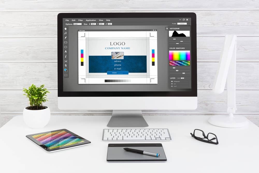
When choosing your color palette, it's also essential to consider the principles of color theory, such as complementary colors, analogous colors, and color harmony. Complementary colors, like blue and orange, create a strong contrast and can make your logo stand out. Analogous colors, on the other hand, create a more harmonious and soothing effect.
Select an Appropriate Font
To ensure a cohesive and professional look for your logo, carefully choose an appropriate font that aligns with your brand's personality and conveys the right message to your audience. Font selection plays a crucial role in creating a strong visual identity for your e-commerce store.
Here are some tips to help you make the right choice:
Consider your brand's personality: Is it playful, sophisticated, or modern? Choose a font that reflects the essence of your brand.
Typography trends: Stay updated with current typography trends to ensure your logo looks contemporary and relevant.
Readability: Ensure that the font you choose is easy to read, even at different sizes or in different contexts.
Use High-Quality Graphics and Images
When it comes to logo design, the use of high-quality graphics and images is crucial. The graphic impact of a logo plays a significant role in branding, helping to create a lasting impression on customers.

Additionally, using relevant images that align with your brand's messaging can enhance the overall effectiveness of your logo.
Graphic Impact on Branding
The successful branding of a company heavily relies on the use of high-quality graphics and images. Visual communication plays a crucial role in capturing the attention of potential customers and conveying the brand's message effectively. Here are three key ways in which high-quality graphics and images can have a significant impact on branding:
Memorability: Eye-catching visuals have the power to leave a lasting impression on the audience, making it easier for them to recall and recognize your brand.
Professionalism: By using high-quality graphics and images, you demonstrate a commitment to excellence and professionalism, which can enhance the perceived value of your brand.
Brand consistency: Consistent use of high-quality visuals across all marketing materials helps to build brand recognition and reinforce your brand's identity.
Image Relevance for Messaging
Sixty-eight percent of consumers are more likely to engage with a brand that uses high-quality graphics and images in their messaging. In today's digital age, where attention spans are shorter than ever, captivating visuals have become a crucial element of effective brand messaging.
Visual storytelling has the power to convey emotions, tell a story, and create a lasting impression on your audience. When it comes to your e-commerce store, using high-quality graphics and images can make a significant impact on your brand's success. They not only enhance the overall aesthetics of your website but also build trust and credibility with your customers.

Importance of Visual Appeal
Utilize high-quality graphics and images to enhance the visual appeal of your e-commerce store and captivate your target audience. Visual aesthetics play a crucial role in attracting users and creating a memorable brand image.
Here are three reasons why using high-quality graphics and images is important for your e-commerce store:
First Impressions: The first thing users notice when visiting your store is the visual elements. High-quality graphics and images create a positive first impression, making users more likely to stay and explore further.
User Engagement: Compelling visuals grab attention and keep users engaged. By using visually appealing graphics and images, you can effectively convey your brand's message, products, and offers, encouraging users to take action and make a purchase.
Brand Credibility: High-quality graphics and images reflect professionalism and attention to detail. They instill trust in your brand and make users feel confident about buying from you.
Ensure Scalability and Versatility
When designing a logo for your e-commerce store, it's crucial to ensure scalability and versatility. This means considering the size of your logo and how it will adapt across different platforms, such as websites, social media profiles, and packaging.
Additionally, maintaining consistency across these mediums is key to establishing a strong and recognizable brand identity. By prioritizing scalability and versatility, you can create a logo that remains impactful and visually appealing, regardless of its context.
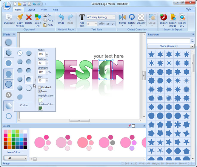
Size and Adaptability
Ensuring the scalability and versatility of your logo is crucial for effective brand representation across various platforms. A well-designed logo should be able to adapt and maintain its visual impact regardless of its size or the medium it is being displayed on.
Here are some tips to ensure the size and adaptability of your logo:
Keep it simple: A simple logo design with clean lines and minimal details will be easier to scale down without losing its impact.
Test different sizes: Make sure to test your logo in various sizes to ensure readability and visibility.
Consider different backgrounds: Design your logo to work well on both light and dark backgrounds, ensuring adaptability across different scenarios.
Achieve optimal scalability and versatility by designing your logo to seamlessly adapt across various platforms and devices. Platform design plays a crucial role in ensuring that your logo looks great and maintains its integrity across different mediums.
With the rise of mobile devices and different screen sizes, it is important to create a logo that is responsive and adaptable. This means that your logo should be easily recognizable and legible whether it is displayed on a small mobile screen or a large desktop monitor.
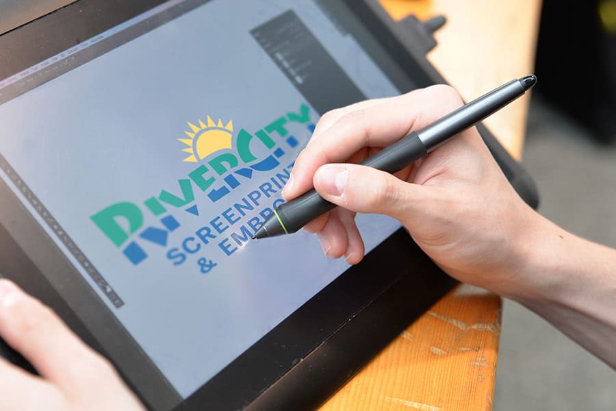
Additionally, responsive branding involves designing your logo in a way that allows it to be easily resized without losing its visual impact. By considering platform design and creating a logo that is versatile and scalable, you can ensure that your brand identity remains consistent and effective across all platforms.
Consistency Across Mediums
To maintain a cohesive and impactful brand image, it is essential to ensure consistency across different mediums by designing a logo that is scalable and versatile. Consistency across mediums refers to the ability of a logo to look visually appealing and maintain its integrity when displayed across various platforms such as websites, social media profiles, print materials, and merchandise.
Here are three key considerations for achieving medium consistency:
Scalability: Ensure that your logo can be resized without losing its clarity or becoming distorted. This allows your logo to be displayed in various sizes without compromising its visual impact.
Versatility: Design a logo that can be easily adapted to different color schemes, backgrounds, and layouts. This allows your logo to seamlessly integrate with different mediums and maintain its visual appeal.
Brand consistency: Ensure that your logo aligns with your brand's overall aesthetics, values, and messaging. Consistency in design elements such as fonts, colors, and imagery helps to create a strong and recognizable brand identity across all mediums.
Pay Attention to Alignment and Proportions
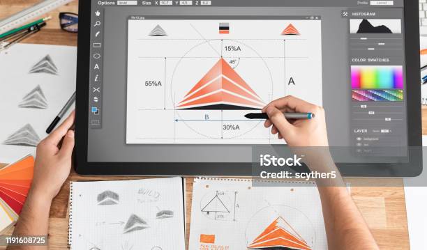
The alignment and proportions of your logo design are crucial factors that should be carefully considered for a professional and visually appealing result.
When it comes to alignment techniques, it's important to ensure that all elements of your logo are properly aligned. This includes text, graphics, and any other visual elements. Aligning these components will create a sense of balance and harmony in your design.
Proportion guidelines are equally important, as they determine the size relationship between different elements of your logo. Ensuring that proportions are consistent throughout your logo will help create a cohesive and polished look.
It's important to pay attention to both alignment and proportions to achieve a logo that is visually pleasing and professional. Taking the time to carefully consider these factors will elevate the overall design of your e-commerce store.
When designing a logo for your e-commerce store, it is crucial to test its compatibility across different platforms.
This involves ensuring that your logo looks consistent and professional on websites, mobile apps, social media profiles, and other digital platforms.
Platform compatibility testing is essential for ensuring that your logo looks consistent and professional across various platforms. It involves conducting a platform compatibility analysis to identify any issues that may arise when your logo is displayed on different devices and platforms. By testing your logo across different platforms, you can optimize its appearance and ensure that it is visually appealing on all devices, including desktops, laptops, tablets, and mobile phones.
Here are three reasons why platform compatibility testing is crucial for your logo design:

Consistency: Testing your logo across different platforms ensures that it maintains consistency in terms of colors, fonts, and overall design. This consistency helps to establish a strong brand identity and builds trust with your audience.
Visibility: By testing your logo on various screen sizes and resolutions, you can ensure that it remains visible and legible, regardless of the device used. This is particularly important for mobile devices, where screen real estate is limited.
Professionalism: A logo that appears distorted or unprofessional on certain platforms can give a negative impression of your brand. By conducting platform compatibility testing, you can avoid such issues and maintain a professional image across all platforms.
Logo Consistency Check
Ensuring the consistency of your logo across different platforms is crucial, as it helps to maintain a professional and cohesive brand image.
One important aspect to consider during the logo consistency check is logo alignment. Your logo should be aligned properly across different platforms, such as your website, social media profiles, and marketing materials. It should be centered and positioned in a way that is visually appealing and balanced.
Another factor to consider is logo proportions. Your logo should be scaled appropriately to fit different platforms without losing its integrity. It should be easily recognizable and not appear distorted or stretched.
To achieve optimal brand recognition and consistency, test your logo across various platforms to ensure its seamless integration. This step is crucial in today's digital age, where consumers interact with brands across multiple devices and platforms.
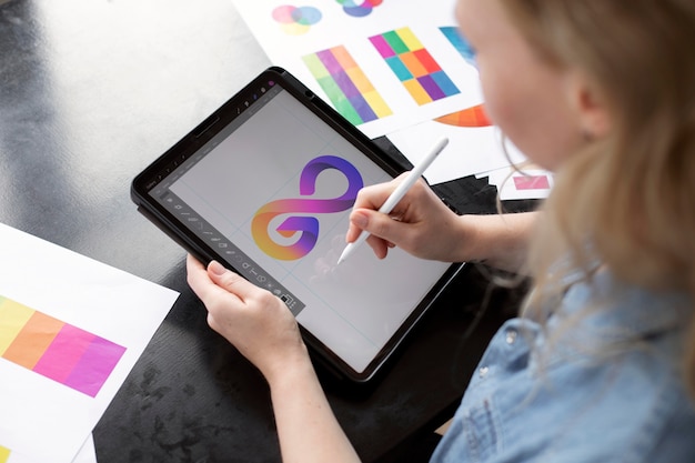
Here are three reasons why cross-platform logo optimization is essential:
Platform Compatibility: Different platforms have varying display requirements and limitations. By testing your logo across various platforms such as websites, social media profiles, and mobile apps, you can ensure that it appears correctly and maintains its visual appeal.
Logo Consistency: Consistency is key to establishing a strong brand identity. By testing your logo across different platforms, you can ensure that it looks consistent and recognizable across all mediums, reinforcing your brand image in the minds of your audience.
Adaptation to Different Screen Sizes: With the increasing use of mobile devices, it's important to ensure that your logo is responsive and adapts well to different screen sizes. Testing your logo across platforms allows you to make any necessary adjustments to ensure optimal visibility and legibility.
Seek Feedback and Iterate
Gather input from professionals and refine your logo design through continuous feedback and iteration. Seeking feedback is a crucial step in the logo design process, as it helps you gain valuable insights and perspectives from experts in the field.
By implementing feedback, you can identify areas of improvement and make necessary changes to create a more impactful logo. It is important to engage in an iterative design process, where you constantly refine and evolve your logo based on feedback.
This iterative approach allows you to experiment with different design elements, colors, and fonts, ensuring that your logo aligns with your brand identity and resonates with your target audience. Embrace the freedom to explore different possibilities and adapt your logo design accordingly to create a visually appealing and memorable brand identity.
Frequently Asked Questions
How Do I Choose the Right Color Palette for My Logo Design?
Choosing the right color palette for logo design can be challenging. Popular color combinations for e-commerce logos include blue and white, green and black, and red and yellow. Incorporate your brand's personality by using colors that align with your brand values and target audience.
What Are Some Tips for Selecting an Appropriate Font for My E-Commerce Store Logo?
When selecting a font for your e-commerce store logo, consider font pairing and the symbolism of the chosen font. Font pairing ensures a cohesive and visually appealing design, while symbolism helps convey the desired message to your audience.
To ensure scalability and platform compatibility for your logo, it is important to use vector-based software, choose simple and clean designs, and test its visibility across different sizes and mediums.
When testing your logo across different platforms, it is important to consider its visibility and ensure consistent branding. By evaluating its legibility, size, and adaptability, you can ensure that your logo effectively represents your brand on various mediums.
What Are Some Effective Strategies for Seeking Feedback and Iterating on My Logo Design?
When seeking feedback and iterating on logo design, it is essential to engage with a diverse range of stakeholders, including customers, industry experts, and design professionals. This collaborative approach ensures a comprehensive evaluation and facilitates continuous improvement.
 Digital Art InstructionDIY Infographics DesignMobile Game ArtworkPersonalized Logo Design3D AnimationeBook Covers DesignPrivacy PolicyTerms And Conditions
