Understanding Lifestyle Guide Cover Styling
In the realm of digital publishing, lifestyle guide cover styling plays a pivotal role in attracting readers. A well-designed cover not only reflects the content within but also serves as a visual representation of the author's brand. The cover is often the first interaction a potential reader has with the eBook, making it imperative to create a striking and memorable design.
The Importance of eBook Aesthetics
eBook aesthetics encompass the visual appeal of the cover, including elements such as imagery, typography, and color schemes. Aesthetic choices should resonate with the target audience and reflect the themes of the content. For instance, a lifestyle guide focused on wellness may utilize calming colors and serene imagery, while a travel guide might feature vibrant landscapes and adventurous typography.
When designing an eBook cover, consider the emotions you want to evoke in your audience. The right aesthetic can create a sense of connection, making readers more likely to engage with the content.
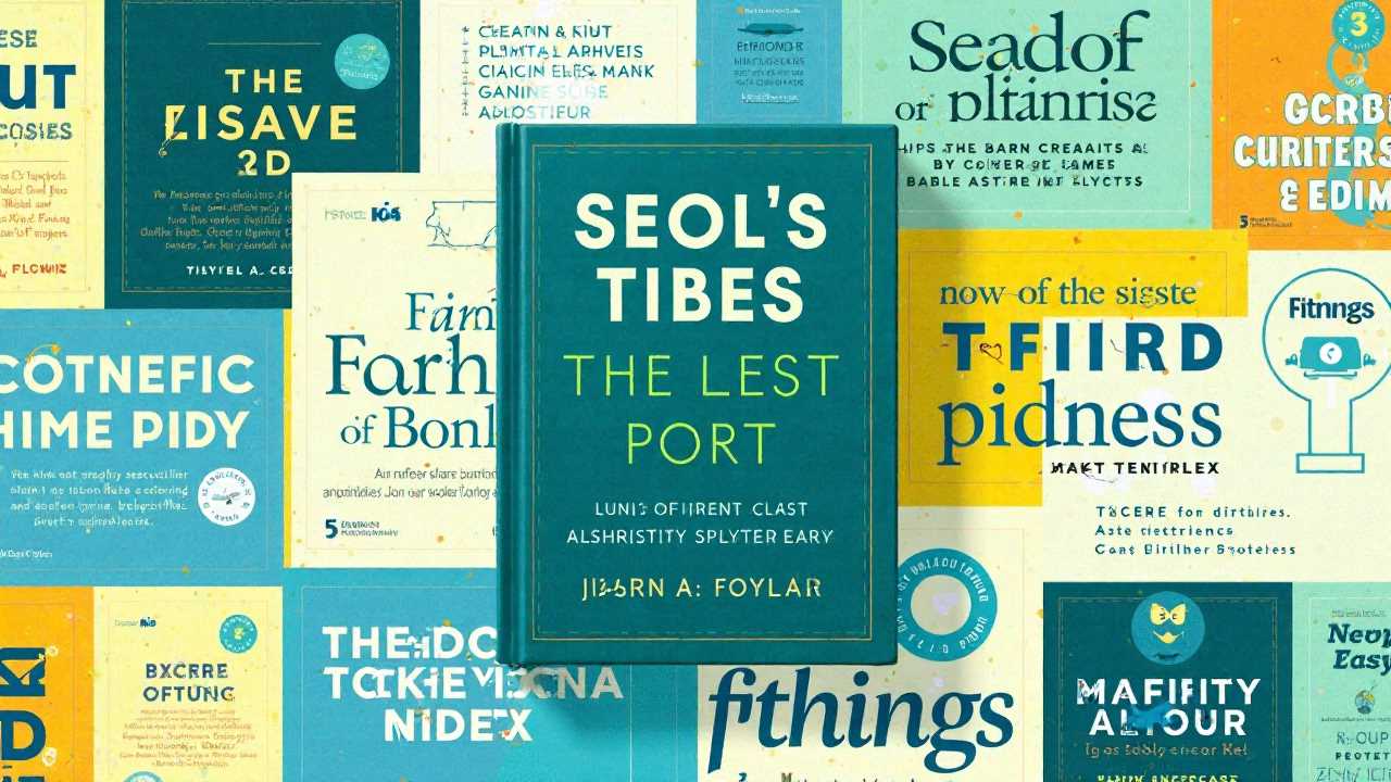
Mastering Visual Hierarchy
Visual hierarchy is a crucial aspect of cover design that guides the viewer's eye to the most important elements. This can be achieved through size, color, and placement of text and images. The title of the eBook should be the most prominent feature, followed by the author's name and any additional information, such as a subtitle or tagline.
Using contrasting colors can help emphasize key elements. For example, a bold title in a bright color against a muted background can draw attention immediately. Additionally, the use of whitespace is essential; it allows the design to breathe and prevents the cover from feeling cluttered.
Typography Choices That Speak Volumes
Typography choices are more than just selecting a font; they convey the personality of the eBook. The right typography can set the tone and enhance the overall aesthetic. For lifestyle guides, consider using clean, modern fonts that are easy to read. Serif fonts can evoke a sense of tradition and reliability, while sans-serif fonts often feel more contemporary and approachable.
When selecting fonts, limit yourself to two or three styles to maintain cohesion. Use one font for the title, another for the subtitle, and perhaps a third for the author's name. Ensure that the fonts complement each other and align with the overall theme of the guide.
Choosing the Right Color Palettes
Color palettes play a significant role in conveying the mood and message of the eBook. Colors evoke emotions and can influence a reader's perception of the content. For instance, soft pastels may suggest tranquility and relaxation, while bold, saturated colors can convey energy and excitement.
When creating a color palette, consider the psychological effects of colors. Blue often represents trust and calmness, while red can signify passion and urgency. Aim for a harmonious combination that aligns with the lifestyle themes presented in the guide. Tools like Adobe Color can assist in creating appealing color schemes.
Imagery Selection That Resonates
Imagery selection is another vital component of lifestyle guide cover styling. The images used should be high-quality and relevant to the content. They should not only capture attention but also provide insight into what the reader can expect from the guide.
For lifestyle guides, consider using images that depict real-life scenarios, such as people engaging in activities related to the content. This approach helps potential readers visualize themselves using the guide and enhances relatability. Stock photo websites offer a plethora of options, but ensure that the images chosen are unique and not overly clichéd.
Effective Layout Techniques
Layout techniques are essential for creating a balanced and visually appealing cover. The arrangement of text and images should guide the viewer's eye naturally across the cover. Start by sketching a few layout ideas before committing to a design.
Consider the rule of thirds, which suggests dividing the cover into three equal sections both horizontally and vertically. Place key elements along these lines or at their intersections to create a more dynamic composition. Ensure that the layout is not only aesthetically pleasing but also functional, allowing for easy readability.
Finalizing the Design
Once all elements are in place, it’s time to finalize the design. Review the cover for consistency in style, color, and typography. Ensure that the title is legible even in thumbnail size, as many readers will first encounter the eBook in a digital store.
Seek feedback from peers or target audience members. Fresh eyes can provide valuable insights and help identify any areas for improvement. After making necessary adjustments, prepare the cover for publication, ensuring that it meets the required specifications for various eBook platforms.
Mastering lifestyle guide cover styling involves a careful balance of aesthetics, visual hierarchy, typography choices, color palettes, imagery selection, and layout techniques. By paying attention to these elements, we can create covers that not only attract readers but also effectively communicate the essence of the content within. A well-crafted eBook cover is an investment in the success of the guide, setting the stage for a rewarding reading experience.
 Digital Art InstructionDIY Infographics DesignMobile Game ArtworkPersonalized Logo Design3D AnimationeBook Covers DesignPrivacy PolicyTerms And Conditions