Understanding Language Learning Infographics
Language learning infographics serve as a powerful tool for educators and learners alike. They transform complex information into visually engaging formats that facilitate understanding and retention. By utilizing educational graphics, we can present language concepts, vocabulary, and grammar rules in a way that captures attention and enhances comprehension. Infographics are not just about aesthetics; they are a means of visual communication that can significantly improve the learning experience.
Why DIY Infographics Matter
Creating your own infographics allows for a personalized approach to language learning. DIY infographics enable educators to tailor content to the specific needs of their students. This customization can include the selection of relevant vocabulary, cultural references, and examples that resonate with the target audience. By engaging in the DIY infographics process, educators can foster creativity and encourage students to take ownership of their learning.
Essential Design Tips for Effective Infographics
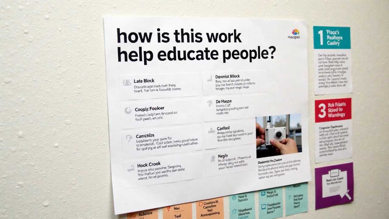
When designing language learning infographics, several key principles should be considered to ensure effectiveness and clarity.
1. Choose a Clear Focus
Every infographic should have a clear focus or message. Determine the primary concept you want to convey, whether it's a specific grammar rule, vocabulary set, or cultural aspect. This focus will guide your design choices and help maintain clarity throughout the infographic.
2. Utilize Creative Layouts
The layout of your infographic plays a crucial role in how information is presented. Consider using a grid system to organize content logically. Creative layouts can include sections for definitions, examples, and visual aids. Ensure that the flow of information is intuitive, allowing viewers to easily navigate through the content.
3. Incorporate Visual Elements
Visual elements such as icons, images, and charts can enhance understanding and retention. Use relevant visuals that complement the text and reinforce the message. For instance, when teaching vocabulary, consider using images that represent the words visually. This approach aids in data visualization, making abstract concepts more tangible.
4. Maintain Consistency in Design
Consistency is key in infographic design. Use a cohesive color palette, typography, and icon style throughout the infographic. This consistency not only enhances visual appeal but also helps viewers process information more easily. Stick to two or three main colors and a couple of fonts to maintain a professional look.
5. Prioritize Readability
Readability is paramount in any infographic. Ensure that text is legible by choosing appropriate font sizes and styles. Avoid cluttering the design with excessive text; instead, use bullet points or short phrases to convey information succinctly. Remember, the goal is to communicate effectively, not overwhelm the viewer.
Leveraging Data Visualization Techniques
Data visualization is an integral part of creating impactful language learning infographics. By representing data visually, we can highlight trends, comparisons, and relationships that may not be immediately apparent in text form.
1. Use Charts and Graphs
Incorporating charts and graphs can help illustrate statistical information related to language learning. For example, a bar graph showing the frequency of certain vocabulary words in different contexts can provide valuable insights. Ensure that these visual representations are simple and easy to interpret.
2. Highlight Key Statistics
When presenting data, emphasize key statistics that support your message. Use bold text or contrasting colors to draw attention to important figures. This technique can help reinforce the significance of the information being presented.
3. Create Infographics for Different Learning Styles
Recognize that learners have diverse preferences when it comes to absorbing information. Some may prefer visual aids, while others may benefit from textual explanations. By creating infographics that cater to different learning styles, you can enhance engagement and comprehension across the board.
Tools for Creating DIY Infographics
There are numerous tools available that can assist in the creation of DIY infographics. Many of these platforms offer user-friendly interfaces and templates that simplify the design process.
1. Canva
Canva is a popular graphic design tool that provides a wide range of templates for infographics. With its drag-and-drop functionality, users can easily customize designs to suit their needs. Canva also offers a library of icons, images, and fonts to enhance the visual appeal of your infographics.
2. Piktochart
Piktochart specializes in creating infographics and presentations. It offers a variety of templates tailored for educational purposes. Users can incorporate charts, maps, and icons to create visually engaging content that effectively communicates language learning concepts.
3. Venngage
Venngage is another excellent tool for designing infographics. It provides a range of customizable templates and design elements. Users can create infographics that align with their specific language learning objectives, making it a valuable resource for educators.
Crafting Impactful Language Learning Infographics
In summary, mastering the art of language learning infographics involves understanding the principles of effective design and utilizing DIY infographics to create personalized educational graphics. By implementing design tips, leveraging data visualization techniques, and utilizing available tools, educators can craft stunning infographics that enhance visual communication and facilitate language learning. Embrace the power of infographics to transform the educational experience and engage learners in meaningful ways.
 Digital Art InstructionDIY Infographics DesignMobile Game ArtworkPersonalized Logo Design3D AnimationeBook Covers DesignPrivacy PolicyTerms And Conditions