In today's data-driven world, infographics can be powerful marketing tools for brands. By merging visual appeal and data, they effectively communicate complex information.
However, aligning them with your brand identity can be tricky. This article will delve into seven critical elements to consider when creating infographics that reflect your brand.
These elements include understanding core values, color schemes, and typography. It is important to strategically use data and visual elements to create a clear, simple, and innovative brand representation.
Understanding the Core Values of Your Brand
The first step in creating infographics that accurately reflect your brand involves identifying and understanding the three to five core values that define your company's identity and mission. These core values play a crucial role in shaping your brand personality and are instrumental in mission representation. They form the backbone of your brand's strategic narrative and provide a consistent theme that resonates with your target audience.
Infographics must creatively encapsulate these values, communicating them in an engaging and innovative manner. This not only fosters brand recognition but also strengthens the relationship with the audience. In this endeavor, precision, creativity, and strategic thinking are paramount.
Understanding your brand's core values is, thus, a pivotal step in creating compelling brand-centric infographics.
The Importance of Consistent Color Schemes
In crafting infographics that effectively embody your brand, maintaining consistent color schemes becomes an integral factor to consider. The psychology of colors plays a fundamental role in shaping the impact on audience perception. For example, blue is often associated with trust and reliability, while red can evoke a sense of urgency or excitement.
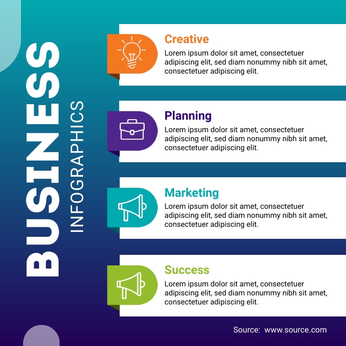
By applying a consistent color scheme across your infographics, you create a visual connection with your brand, enhancing recognition and recall. This strategy also supports brand consistency, a crucial element in building brand identity.
Color consistency, therefore, is not merely an aesthetic choice; it is a strategic decision aimed at optimizing audience engagement and enhancing the overall effectiveness of your infographics.
The Role of Typography in Branding
Frequently overlooked, typography plays an indispensable role in branding as it communicates the personality, values, and overall vibe of a brand.
Font Psychology: Different fonts elicit different emotional responses. For instance, serif fonts are often seen as traditional and reliable, while sans-serif fonts are viewed as modern and innovative.
Legibility Importance: A font that's hard to read can negatively impact your brand's perception. Prioritize clarity and legibility when choosing your brand's typography.
Consistency: Just like colors, maintaining consistency in typography across all brand materials helps in building brand recognition.
Size and Spacing: The size of type and spacing between lines and letters significantly affect the readability and overall visual impact.
Utilizing Data and Statistics Effectively
Drawing from credible sources and presenting data accurately can build up your brand's reputation for reliability. It's equally essential to keep your infographics engaging and digestible for your audience.
Effective data sourcing strategies involve selecting data that is both recent and relevant. It should offer insights that underline your brand's unique position and value proposition.
Infographic layout planning is another crucial component. Strategic placement of data points, using innovative visual elements, can enhance comprehension and retention. Remember, the goal is not to overwhelm, but to educate and engage.
Creativity, in conjunction with accurate data representation, can make your infographics a powerful tool that truly reflects your brand.
Choosing the Right Visual Elements
Selecting the appropriate visual components is an essential step in infographic creation that effectively mirrors your brand. A critical examination of elements such as color palette selection, iconography, and imagery is required.
These components, when strategically chosen and creatively implemented, will enhance the overall aesthetic appeal and impact of your infographic, ensuring it aligns with your brand identity and messaging.
Color Palette Selection
Incorporating a well-chosen color palette into your infographic is a critical aspect of aligning the visuals with your brand identity. The psychology of colors and cultural associations of colors play a significant role in this process.
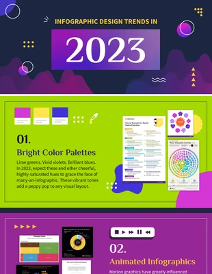
Understand the Psychology of Colors: Colors evoke emotions and reactions. For instance, red signifies urgency or passion, while blue suggests trust and calmness.
Acknowledge Cultural Associations: Colors have different meanings in various cultures. Green may symbolize luck in some cultures, but it might signify jealousy in others.
Align with Your Brand: Your color palette should complement your brand's identity. Maintaining consistency helps boost brand recognition.
Test and Refine: Experiment with different shades and tones. Gather feedback and refine your color selection to optimize visual impact and brand recall.
Iconography and Imagery
During the process of creating infographics, it is crucial to spend adequate time on the selection and integration of appropriate iconography and imagery, as these visual elements significantly contribute to the overall perception of your brand.
This task calls for a careful balance of symbol selection and visual metaphor usage, both of which should align with your brand persona and message. Consider choosing symbols that aptly represent key concepts in your content.
Meanwhile, the use of visual metaphors can enhance comprehension and engagement, as they allow you to convey complex ideas in a more tangible and intuitive way. Be innovative in combining these elements to create a visual narrative that not only delivers information but also reinforces your brand identity.

Ensuring Clarity and Simplicity in Design
Understanding the importance of clarity and simplicity in your infographic design is paramount to effectively communicate your brand's message.
A balance between aesthetics and information is key, ensuring that the design is attractive yet not overly complex, which could potentially confuse the audience.
This critical element helps to create a seamless and efficient visual representation of your brand that can be easily grasped and remembered by your audience.
While the visual appeal of an infographic is essential, it is equally important to maintain a balance between aesthetics and clear, simple information presentation to effectively convey your brand message. This balance is achieved through design harmony and the right information density. Here are four strategic ways to do so:
Design Harmony: Consistent use of colors, fonts, and shapes that align with your brand's identity fosters a visually appealing infographic.
Information Density: Too much information can overwhelm the viewer. Keep your message concise and straightforward.
Simplicity: A complex design can detract from your message. Aim for a clean, easy-to-understand layout.
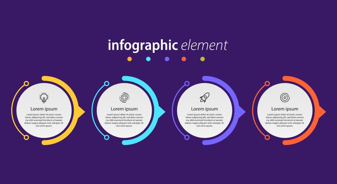
Visual Storytelling: Use creative elements to tell a story, making your infographic engaging and memorable.
Avoiding Overly Complex Designs
In the realm of infographic design, simplicity is not just a virtue, but a necessity. Avoiding overly complex designs is critical to create impactful, easy-to-understand visuals. Design simplicity is the strategic key to unlock maximum infographic readability. It allows the audience to grasp the message quickly without getting lost in intricate details.
Overly complex designs can often confuse viewers, diluting the core message and diminishing the overall impact. The ideal approach is to streamline information, using innovative design techniques to visualize data in the most straightforward manner. Remember, the goal is to communicate, not to perplex.
Clever use of color, typography, and layout can significantly enhance clarity while maintaining a creative edge. Always aim to create a harmonious balance between design simplicity and information density.
Aligning Infographic Style With Your Brand's Voice
You must ensure that the style of your infographic effectively aligns with the unique voice of your brand. Voice consistency and infographic tone play a pivotal role in maintaining a coherent brand identity.
Here are four strategic steps to align your infographic style with your brand's voice:
Identify your brand's tone: It could be professional, quirky, serious, or friendly. Your infographic should echo this tone.

Utilize brand colors: Your brand colors can reflect your brand's personality and help maintain consistency.
Choose appropriate typography: The font style should resonate with your brand's voice.
Incorporate relevant imagery: Images should be in sync with your brand message, contributing to the overall voice.
Frequently Asked Questions
What Are the Cost Implications of Creating a Brand-Specific Infographic?
Creating a brand-specific infographic demands careful budgeting strategies. It entails design expenses for professional graphic design, data research, and potential software costs. Innovative, yet cost-effective methods can optimize these costs for better return on investment.
How Can We Measure the Success or Effectiveness of Our Infographic?
The success of an infographic can be gauged through Infographic Analytics, which assess user engagement and interaction. Additionally, tracking conversion rates provides insights into the efficacy of the infographic in driving desired customer actions.
How Often Should We Update or Revise Our Infographics?
The timing of infographic revision should be strategically determined by the relevance and freshness of your content. Regular updates, ideally quarterly or biannually, can maintain engagement and reflect your brand's commitment to innovation and current trends.
Can Infographics Be Used for Internal Communication Within the Company?
Yes, infographics can be highly beneficial in internal communication. They offer a compelling method for data visualization, making complex information digestible. Infographic designing can enhance understanding and engagement among employees, fostering an innovative, informed work environment.
How Can We Optimize Our Infographics for Seo?
Optimizing infographics for SEO involves strategic keyword incorporation within the content and creative usage of alt text. This ensures search engines understand the infographic's context, enhancing visibility and improving your brand's search rankings.
 Digital Art InstructionDIY Infographics DesignMobile Game ArtworkPersonalized Logo Design3D AnimationeBook Covers DesignPrivacy PolicyTerms And Conditions
